Logo for a biotechnology investment fund

  • Estado: Closed
  • Premio: €30
  • Propuestas recibidas: 44
  • Ganador: KingoftheLogo

Resumen del concurso

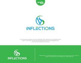
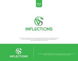
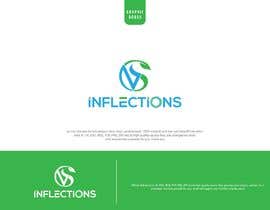
We need a logo for a biotechnology (medicines) investment fund called 'SV Inflections'. We will invest for our clients into public biotechnology stocks whereby we pick companies which are close to jumps in the stock price ('inflections') and then cycle through those inflections by reinvesting the money after the stock price jump into the next company. Thus 'SV Inflections'.

The product will target very high net worth individuals with a minimum investment size of $200,000, thus the look and feel of the product needs to be minimalistic and clean cut (sans serif, NO retail kind of style with millions of complex elements to it).

Attached is the example of two logos we were playing with as well as several other logos from our competitors and/or other financial products. Our current look is black/grey as can be seen on the attached cover page of our presentation but given the feedback that it looked to 'tombstone like', we would also experiment with a deep blue (like deep diving) design.

After the logo, we will also need business card designs, powerpoint presentation redesign/cleaning, powerpoint templates and a cleaning of the website.

Best regards,
Jonathan

Habilidades recomendadas

Comentarios del empleador

“Good job on designing a logo in a context”

Imagen del perfil Joesywales, Germany.

Principales propuestas de este concurso

Ver más participaciones

Tablero de aclaración pública

  • Joesywales
    Organizador del concurso
    • 5 años atrás

    Everybody, please remove the leafs! We are no garden center instead a medicine investment fund. Either just remove the leaf or try something like a DNA helix, a molecule, a pill, a body, a stethoscope or something related to medicine. Thanks!

    • 5 años atrás
    1. Joesywales
      Organizador del concurso
      • 5 años atrás

      I uploaded a few example images (molecule, DNA etc) which would be really great to integrate instead of a leaf. Thanks

      • 5 años atrás
  • DesignBadir
    DesignBadir
    • 5 años atrás

    Hi Sir.. I Have A Logo That You Want, I Try To Make It.. I Hope You Like It..

    • 5 años atrás
  • Joesywales
    Organizador del concurso
    • 5 años atrás

    What I would be also looking for is a logo similar to entry #8 by ciprian but with the green of entry from entry #31 . Also, something unique should be in the circle of the SV. Two things which could look really cool could be a vitruvian man or also a DNA helix!

    • 5 años atrás
  • RupokMajumder
    RupokMajumder
    • 5 años atrás

    dear sir please check my new entry #42

    • 5 años atrás
  • Joesywales
    Organizador del concurso
    • 5 años atrás

    I do also like the plant/leaf design because it has a unique element to it without being too overloaded (like the bird in the blockwall logo example I uploaded). Unfortunately, the plant does not really relate to our business of investing into medicines. Could a similar design maybe also work with another element like a pill (or a fountain/rain of pills), a cell, a human body, a molecule, an atom or something similar without looking too trashy?

    • 5 años atrás
    1. Joesywales
      Organizador del concurso
      • 5 años atrás

      thanks for submitting the new plant designs but please read the post again. I like the unique touch to the design but the plant/leave itself does not fit/relate to our business of investments and medicines. Thus, please do not use a plant/leaf but instead something like a pill, cell, human body etc (more medicine like)

      • 5 años atrás
    2. Joesywales
      Organizador del concurso
      • 5 años atrás

      or maybe even a stethoscope

      • 5 años atrás
  • RupokMajumder
    RupokMajumder
    • 5 años atrás

    dear sir please check my new entry #28 , #29

    • 5 años atrás
    1. Joesywales
      Organizador del concurso
      • 5 años atrás

      Thanks, looks great! Is it possible to make the circle for SV a bit less thick or as a rough line or of varying thickness to give it a bit of a unique feel? (Please look at the circle at the circled SV in the uploaded example logo)

      • 5 años atrás
    2. Joesywales
      Organizador del concurso
      • 5 años atrás

      The fond of the 'inflections' of #29 is good and the design of the SV as well. Just feels a bit of a unique feel

      • 5 años atrás
  • Joesywales
    Organizador del concurso
    • 5 años atrás

    I have now given feedback and comments to all designs. Thanks to you all!

    • 5 años atrás
  • Joesywales
    Organizador del concurso
    • 5 años atrás

    More minimalistic. Please see again the example logos I uploaded

    • 5 años atrás
  • Joesywales
    Organizador del concurso
    • 5 años atrás

    Please more business like, less gaming like. Thanks

    • 5 años atrás
  • Joesywales
    Organizador del concurso
    • 5 años atrás

    Thank you all for the submissions. Please do not use that much red since many people associate it with negative stock movements. Also, in please make sure that the font does not get cryptic and 'gaming like' since we will manage other peoples money and gaming would be the last thing the clients want. Thanks to you all!

    • 5 años atrás
  • Sanambhatti
    Sanambhatti
    • 5 años atrás

    please check #2

    • 5 años atrás

Mostrar más comentarios

Cómo comenzar con los concursos

  • Publica tu concurso

    Publica tu concurso Fácil y rápido

  • Recibe montones de propuestas

    Consigue toneladas de propuestas De todo el mundo

  • Elige la mejor propuesta

    Elige la mejor propuesta ¡Descarga fácilmente los archivos!

Publica un concurso ahora o únete a nosotros hoy