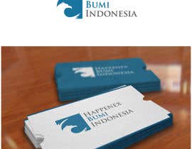
Logo Design for International Commodity Trader
- Estado: Closed
- Premio: $290
- Propuestas recibidas: 64
- Ganador: gfxbucket
Resumen del concurso
International trader of commodities such as coal, nickel ore, palm oil.
Habilidades recomendadas
Comentarios del empleador
“Excellent work! Full understanding of the requirements. Very original ideas! Well done!”
![]() happenex, Belgium.
happenex, Belgium.
Tablero de aclaración pública
-

Organizador del concurso - 11 años atrás
Dear participants:
We have combined votes of management and designers and here are the results:
Results
1st place 37
2nd place 127
3rd place 95 107 130
Thank you all of you for submitting your designs!
In a short time we will be hosting competition to design letterhead + envelopes as well as business cards and we will be more than welcome to accept your designs.
Once again thank you all and good luck!- 11 años atrás
-

ejom
- 11 años atrás
By the way, Congratulation to the winner. Thanks a lot to my VOTERS that I even know who they are at all. I really appreciate your time. And to the Contest Holder, Thanks for making this CONTEST. BRAVO FREELANCER!!!
- 11 años atrás
-

ejom
- 11 años atrás
By the way, Congratulation to the winner. Thanks a lot to my VOTERS that I even DO NOT know who they are at all. I really appreciate your time. And to the Contest Holder, Thanks for making this CONTEST. BRAVO FREELANCER!!!
- 11 años atrás
-

anzartwork
- 11 años atrás
I will proud make a logo for Indonesia Company, because I'm a Indonesian.
- 11 años atrás
-

Organizador del concurso - 11 años atrás
Dear participants:
Two hours left before the contest will be finished. We do not expect any new entries at this stage. Yet, we would like you to help us one more time.
We are inviting all participants and their friends to rate shortlisted designs. The result of public vote will be added to the result of management to form the final decision!
You can vote/forward the following link to your friends: http://www.freelancer.com/contest/poll-MTA4NjI6Mg==
Thank you and good luck!- 11 años atrás
-

ejom
- 11 años atrás
#130 (Just a little bit modification to make the "Letter B" more clear on the logo from my entry at #75 )
Thanks before. :D- 11 años atrás
-

nayrix101
- 11 años atrás
sorry its, #121 ... TY!
- 11 años atrás
-

nayrix101
- 11 años atrás
pLEASE CHECK MY ENTRY #120.. ty!
- 11 años atrás
-

Organizador del concurso - 11 años atrás
Dear Designers: 24 hours left to improve and submit your designs. Designers which received 5 staas are shortlisted! Congratulations!
- 11 años atrás
-

sourav221v
- 11 años atrás
Dear Sir, please check #117 #118 .Thanks
- 11 años atrás
-

Organizador del concurso - 11 años atrás
Logo 111: Weak design. Not very interesting. Thank you for trying.
- 11 años atrás
-

Organizador del concurso - 11 años atrás
Logo 110: Some minor improvements by changing color in the name. Thank you.
- 11 años atrás
-

Organizador del concurso - 11 años atrás
Logos 108 and 109: The same as 102-107 with some changes. Well done!
- 11 años atrás
-

Organizador del concurso - 11 años atrás
Logos 102-107: We appreciate your work. Logo 107 is really a good one! Thank you!
- 11 años atrás
-

Organizador del concurso - 11 años atrás
Logo 101: Weak graphics and does not work on the black background.
- 11 años atrás
-

AdityaMalviya
- 11 años atrás
#111
- 11 años atrás
-

Organizador del concurso - 11 años atrás
Logo 97-99: Good design! Maybe even better than 90. Let us think about which one is better )). Maybe text in bold could offset round forms of the letters incorporated into the logo? Thank you!
- 11 años atrás
-

Organizador del concurso - 11 años atrás
Logo 100: We are not sure how to call this one. We think "rip off" would be a good word for this!
Dear, you should not incorporate another logo from an existing company into our logo. It was given only to show how national elements can be incorporated in the logo. But we definitely do not want that you take existing logo and add Happenex Bumi Indonesia to it.
Sorry but it is rejected.- 11 años atrás
-

Organizador del concurso - 11 años atrás
Logo 96: Same as 94. Not classy. Thank you for trying!
- 11 años atrás
-

Organizador del concurso - 11 años atrás
Logo 95: Well done! Good modification to capture our requirements. Thank you!
- 11 años atrás
-

sourav221v
- 11 años atrás
THANK YOU SIR. :)
- 11 años atrás
-

Organizador del concurso - 11 años atrás
Logo 94: For some reason it does not look classy or stylish.
- 11 años atrás
-

diskawijaya
- 11 años atrás
hay HAPPENEX, please check #100
- 11 años atrás
-

Organizador del concurso - 11 años atrás
Logo 90 and 91: Fresh ideas are always welcome. Making logo slightly angled makes it more welcoming for the eyes. Well done!
- 11 años atrás
-

Organizador del concurso - 11 años atrás
Logo 93: Good design as the previous ones. Thank you.
- 11 años atrás
-

Organizador del concurso - 11 años atrás
Logo 92: We do not like the head of the bird. It looks more like pigeon.
- 11 años atrás
-

Organizador del concurso - 11 años atrás
Logo 87-89: Quite industrial design. Will be great for a mining company or company operating in heavy machinery industry.
- 11 años atrás
-

Organizador del concurso - 11 años atrás
Logo 75: Very interesting use of letters in the logo. Quite innovative and formal logo. Thank you!
- 11 años atrás
-

ejom
- 11 años atrás
Terima kasih banyak Pak.
- 11 años atrás
-

edvans
- 11 años atrás
- 11 años atrás
-

arteq04
- 11 años atrás
please check #87 #88 #89 thanks!
- 11 años atrás
-

Organizador del concurso - 11 años atrás
Logo 86: The same like logo 85 but with some color. For some reason, red does not work there.
- 11 años atrás
-

Organizador del concurso - 11 años atrás
Logo 85: It looks like blown up pigeon. Sorry and thank you for trying.
- 11 años atrás
-

Organizador del concurso - 11 años atrás
Logo 84: Good try and good concept. Yet, not quite there because graphical element is a puzzle. Thank you.
- 11 años atrás
-

Organizador del concurso - 11 años atrás
Logo 83: The same Idea but different name. Thank you.
- 11 años atrás
-

arteq04
- 11 años atrás
- 11 años atrás
-

arteq04
- 11 años atrás
- 11 años atrás
-

Organizador del concurso - 11 años atrás
Logo 82: We like the logo and the play with shades of blue at the bottom. Could work! Thank you!
- 11 años atrás
-

Organizador del concurso - 11 años atrás
Logo 81: American eagle on Indonesian flag? Not sure ))
- 11 años atrás
-

Organizador del concurso - 11 años atrás
Logo 80: Not sure if flag on the background works.
- 11 años atrás
-

rezawawan1976
- 11 años atrás
Please check #80. Thanks
- 11 años atrás
-

Organizador del concurso - 11 años atrás
Logos 77-79: Thank you for updating the head of the eagle! We like this logo because you can see that you have put some extra work into it! Well done!
- 11 años atrás
-

Organizador del concurso - 11 años atrás
Logo 76: Quite difficult to identify what is on the logo. A polar bear? Thank you for trying!
- 11 años atrás
-

arteq04
- 11 años atrás
- 11 años atrás
-

jirehmonterona
- 11 años atrás
DESIGNERS ... PLEASE CREATE YOUR OWN IDEA .... I AM THE ONLY ONE GETS THE TRUE THEME COLOR OF THE CONTEST
- 11 años atrás
-

Organizador del concurso - 11 años atrás
Logo 73: Very interesting use of colors. Making logo visually pop out is also out of the box thinking. Use of red is quite interesting because it is present in the national flag. Well done!
- 11 años atrás
-

jirehmonterona
- 11 años atrás
thanks for feed back sir ...
- 11 años atrás
-

Organizador del concurso - 11 años atrás
Logo 72: Just OK. What happened to the bird? Two birds have collided? Thank you for trying!
- 11 años atrás
Cómo comenzar con los concursos
-

Publica tu concurso Fácil y rápido
-

Consigue toneladas de propuestas De todo el mundo
-

Elige la mejor propuesta ¡Descarga fácilmente los archivos!

