Graphic Design for SccheduleBox
- Estado: Closed
- Premio: $100
- Propuestas recibidas: 85
- Ganador: anand224patel

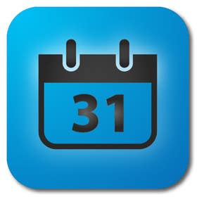
Resumen del concurso
Online Scheduling
Habilidades recomendadas
Comentarios del empleador
“anand224patel did a fantastic job designing my new app icon. Anand224patel communicated clearly throughout the design process and was more reliable and responsive than other designers I was working with. I will definitely hire again for work in the future.”
![]() segway, United States.
segway, United States.
Tablero de aclaración pública
-

anand224patel
- 11 años atrás
Please Read PM
- 11 años atrás
-

badcom
- 11 años atrás
Any thoughts on #135 and #136 , I tried to keep them relatively the same as the ones you like, but not to look to much like copies.
- 11 años atrás
-
anand224patel
- 11 años atrás
Sir, Please Check #128
Thank You....- 11 años atrás
-

mahade87
- 11 años atrás
HI Segway,
Please Check #124 #125
Thanks- 11 años atrás
-

VCool123
- 11 años atrás
120 and 121. A bit too simple imho. Would love feedback and suggestions though.
- 11 años atrás
-

dendrenal
- 11 años atrás
Good day sir,
please check my entry #115 #116 #117 #118 . Thanks- 11 años atrás
-
anand224patel
- 11 años atrás
Sir, Please Check #114.
Thank You....- 11 años atrás
-
anand224patel
- 11 años atrás
Sir, Please Check Private Message for Some Important Details.
Thank You....- 11 años atrás
-
anand224patel
- 11 años atrás
Sir, Please Check #106. Give Some Suggestions Please.
and Also Read PMs I left for you.
Thank You....- 11 años atrás
-

erinyadv
- 11 años atrás
- 11 años atrás
-
anand224patel
- 11 años atrás
Sir, Please Check #99. I've Made Changes as per your Suggestions.
Thank You....- 11 años atrás
-
Shrenik18
- 11 años atrás
I think you might have overlooked the entries in #44 . Can you please give me a feedback? Thanks
- 11 años atrás
-

Organizador del concurso - 11 años atrás
I like the one in the middle the most. I think that maybe the four squares in the center don't make it look more like a calendar. I''ve seen some calendars that had squares placed inside which looked pretty good but here it doesn't seem to fit and having it blank doesn't seem to fit either. Not sure what to advise to improve...
I found the perfect shade of blue today by accident by plugging my computer into an external monitor that had too much red adjustment and the blue's looked perfect. I tried to take a picture of it but the pictures didn't show the same color. I adjusted one of the icons colors myself to get closer to this shade and came up with this: https://www.dropbox.com/s/nbew7f1a399516b/BestBlueYet.mp4
Here is the variation of the blue that I made that is better (almost perfect): https://www.dropbox.com/s/06ha3hux2xpws5q/Screen%20Shot%202012-12-14%20at%2011.26.38%20PM.png- 11 años atrás
-
anand224patel
- 11 años atrás
Check My New One #95.
Thank you ...- 11 años atrás
-
anand224patel
- 11 años atrás
Sir any Suggestions for Changes in #89 ?
- 11 años atrás
-

andresgomezperez
- 11 años atrás
WOULD YOU MIND CHECK #86 AND #90 , PLEASE?
THANKS.- 11 años atrás
-
anand224patel
- 11 años atrás
Hi Sir,
Please Check #89 & Private Message for Some Details.
Thank You....- 11 años atrás
-
Organizador del concurso - 11 años atrás
Hey Karolina182. #8 is your best entry for sure. The shade of blue is too dark. It should be more tones like this: http://www.shutterstock.com/pic-101791198/stock-photo-bright-blue-female-scarf-isolated-on-white.html. Here's my explanation: https://www.dropbox.com/s/k087074izdqbxns/perfectDesign.mp4
- 11 años atrás
Ver 1 mensaje mas
-
Organizador del concurso - 11 años atrás
#46 looks great. the gradient on the blue is great but the hue is not as bright as I'd like it. Please change the # to 31 instead of 21.
- 11 años atrás
-

karolina182
- 11 años atrás
I changed the number and tried to bright the color. If it still not what you're looking for, can you find your 2 favourite blue colors in here: http://www.colourlovers.com/colors/search?hsv=0%2C359%7C0%2C99%7C0%2C99&sortCol=votes&sortBy=desc&publishedEndDate=12%2F14%2F2012&publishedBeginDate=12%2F16%2F2004&query=blue&userName=&x=64&y=23 ? (There are RGB numbers, so I can use the exact number, you'll choose. Thank you :)
- 11 años atrás
-

McFOX
- 11 años atrás
Hello Sir,
Please check #62 #63
Thanks- 11 años atrás
-
McFOX
- 11 años atrás
any suggestions?
- 11 años atrás
-
Organizador del concurso - 11 años atrás
these are great! the blue looks very good. Here are some ideas for improvement: https://www.dropbox.com/s/p5f2ve8twponegx/2012-12-14_0053.mp4
- 11 años atrás
-

cnlbuy
- 11 años atrás
please view my entry #60 .
thank you- 11 años atrás
-
Organizador del concurso - 11 años atrás
Here's another sample of the blue I really like: https://www.dropbox.com/s/jp9f6gtkgu6p0fd/Paul-Mitchell-The-Truth-About-Curls-Collection.jpeg
Maybe by using some kinds of layers, transparencies, texture or background design this kind of blue is possible.- 11 años atrás
-
cnlbuy
- 11 años atrás
& #61
- 11 años atrás
-
ORC1
- 11 años atrás
plz check#57,#58,#59
- 11 años atrás
-
Organizador del concurso - 11 años atrás
Here's another sample of the blue I really like: https://www.dropbox.com/s/jp9f6gtkgu6p0fd/Paul-Mitchell-The-Truth-About-Curls-Collection.jpeg.
Maybe by using some kinds of layers, transparencies, texture or background design this kind of blue is possible.- 11 años atrás
-
Organizador del concurso - 11 años atrás
Here's another sample of the blue I really like: https://www.dropbox.com/s/jp9f6gtkgu6p0fd/Paul-Mitchell-The-Truth-About-Curls-Collection.jpeg
maybe by using some kinds of layers, transparencies, texture or background design this kind of blue is possible.- 11 años atrás
-
Shrenik18
- 11 años atrás
I've incorporated your suggestions into entry #44 . Let me know what you think. Thanks. Also, please check the private message that I left you. Thanks :)
- 11 años atrás
-
cnlbuy
- 11 años atrás
please review my entries #35 & #36 .
thank you- 11 años atrás
-
Shrenik18
- 11 años atrás
How about Entry #27 . Thanks :)
- 11 años atrás
-
Organizador del concurso - 11 años atrás
the blue on 33 is getting to be pretty good. If you could do something more like this it would be ideal: http://www.shutterstock.com/pic-101791198/stock-photo-bright-blue-female-scarf-isolated-on-white.html. I don't like your calendar portion yet. Something like this might be better: http://findicons.com/icon/494477/calendar_year?id=516746
- 11 años atrás
-
Organizador del concurso - 11 años atrás
27 is too colorful for the inside calendar
- 11 años atrás
-
cnlbuy
- 11 años atrás
- 11 años atrás
-
cnlbuy
- 11 años atrás
please view #17 & #19
thank you
cnlbuy- 11 años atrás
-
Organizador del concurso - 11 años atrás
Best designs so far! The blue is getting to be pretty nice. This is the closest image I found that gives the hue of blue that I'm looking for (http://www.shutterstock.com/pic-101791198/stock-photo-bright-blue-female-scarf-isolated-on-white.html). I think the true color I'm looking for comes from having a gradient or maybe a light shadow around the calendar in the center similar to the evernote icon. The calendar in #20 is much better than 19. thanks :)
- 11 años atrás
-
Organizador del concurso - 11 años atrás
Here's more explanation on the blue background: https://www.dropbox.com/s/k087074izdqbxns/perfectDesign.mp4
- 11 años atrás
-
Shrenik18
- 11 años atrás
Entry #13 please. Thanks :)
- 11 años atrás
-
Organizador del concurso - 11 años atrás
Looks pretty good. thanks. I'd like the inside to be simpler & less colorful and the blue to be more VIBRANT. Blue like this would be almost perfect: http://www.shutterstock.com/pic-101791198/stock-photo-bright-blue-female-scarf-isolated-on-white.html but without the dots. It would be more of a gradient or lightspot in the center to give the lighter hues of blue
- 11 años atrás
-
Organizador del concurso - 11 años atrás
OCR1 - thanks for the entry. There's too much color and too much detail in the calendar part, the background should be only blue but best to have a gradient on the blue. Not too dark of a blue.
- 11 años atrás
-
Organizador del concurso - 11 años atrás
None of the blues are yet the right tone/hue. Maybe something a little closer to this type of blue: http://www.shutterstock.com/pic-101791198/stock-photo-bright-blue-female-scarf-isolated-on-white.html but this isn't exactly it either BUT it is closer than the samples so far.
- 11 años atrás
-
Organizador del concurso - 11 años atrás
Here's some more tones/hues of blue that are getting close to the correct color: http://www.shutterstock.com/pic-66230575/stock-photo-blue-water-drops-on-glass.html AND http://www.shutterstock.com/pic-69981448/stock-photo-elegant-background-design-with-space-for-your-text.html
- 11 años atrás
-

reetwik
- 11 años atrás
Thanks for the infos. Will revert back.
- 11 años atrás
Cómo comenzar con los concursos
-

Publica tu concurso Fácil y rápido
-

Consigue toneladas de propuestas De todo el mundo
-

Elige la mejor propuesta ¡Descarga fácilmente los archivos!