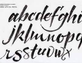
exclusive script/blackboard font for a organic farming organisation
- Estado: Closed
- Premio: €1854
- Propuestas recibidas: 65
- Ganador: johnvargasb

Resumen del concurso
We are a Swiss organic farming non-profit organisation. For web and print purposes we need on top of our corporate font (Futura) a script font. We are looking for something which could have been written on a blackboard with irregular filling, freehand drawn, authentic.
In other words, we need a good typographer/calligrapher to develop an exclusive handwritten, blackboard/chalk/crayon like font with special characters (german, french, spanisch + quotation marks etc..).
------------------------
Details:
After intensive research, we decided that the style we are looking for is close to the font “Monster unleashed” (http://www.dafont.com/monster-unleashed.font).
It could have been quite an ideal fit.
We like its “blackboard / charcoal” effet and the dynamic gesture of the handwriting. This font would make a nice contrast with our corporate font : Futura (On the website we are using Lato for its readabilitly).
But there are 3 problems with this font:
1. It does not include special characters.
2. The author of the font did not answer our requests for a commercial licence and additional fonts.
3. This font is very popular and is used on too many websites. We need something exclusive.
This is why the mission would be to draw a font in this style but NOT identical. We need an exclusive font. So a copy of this font would not be accepted, also for copyright reasons.
We need also a perpetual licence for web, print and advertising. The font also should be delivered in version which can be used on the web.
Habilidades recomendadas
Comentarios del empleador
“Among all the Typographers who did participate in this contest, John was indeed a real pro! I had no doubt that he would succeed in delivering a perfect script font. And he did. He is VERY serious and shows a high level of expertise. I will certainly work with him on variations of this font. Thanks John!! ”
![]() laurentvonach, France.
laurentvonach, France.
Tablero de aclaración pública
-

arnold865
- 7 años atrás
please check my Entry #112 thanks
- 7 años atrás
-

joshilano
- 7 años atrás
Please check #159 .thank you
- 7 años atrás
-
joshilano
- 7 años atrás
Please check #159 .thank you
- 7 años atrás
-
joshilano
- 7 años atrás
Please check #159 .thank you
- 7 años atrás
-
mydesign60
- 7 años atrás
- 7 años atrás
-
mydesign60
- 7 años atrás
- 7 años atrás
-
joshilano
- 7 años atrás
Please check #159 .thank you
- 7 años atrás
-
mydesign60
- 7 años atrás
please check my Entry #148
- 7 años atrás
-

godraw
- 7 años atrás
Please review #152 . Thank you
- 7 años atrás
-
mydesign60
- 7 años atrás
please check my Entry #148
- 7 años atrás
-

picxart
- 7 años atrás
What do you think about entries #108 #109 . Please rate or reject.
- 7 años atrás
-
mydesign60
- 7 años atrás
please check my Entry #148
- 7 años atrás
-

prelldesign
- 7 años atrás
guys i have unsealed my work.. where i got the 3 stars.. :D
#147- 7 años atrás
-
prelldesign
- 7 años atrás
btw.. unnatural is by an handwriting font, when 2 consecutive characters, similars are.. that means eg. if we write "swiss" the two ss are the same! But thats my opinion!
- 7 años atrás
-

purenorth
- 7 años atrás
Entry #119 feedback please
- 7 años atrás
-

vishaldz9ow
- 7 años atrás
- 7 años atrás
-
prelldesign
- 7 años atrás
working on it..
- 7 años atrás
Ver 1 mensaje mas
-
prelldesign
- 7 años atrás
i made the otf font file..
- 7 años atrás
-
prelldesign
- 7 años atrás
any updates? :/
- 7 años atrás
-

Ruelll
- 7 años atrás
http://i.imgur.com/o4bpfch.jpg
For my entries #88 #122 #123 =^^=- 7 años atrás
-
godraw
- 7 años atrás
Please test #126 . Thank you.
- 7 años atrás
-

SolutionsSP
- 7 años atrás
Kindly review my entry #125 . Thanks
- 7 años atrás
-
SolutionsSP
- 7 años atrás
Working on it, CH please wait.
- 7 años atrás
-
Ruelll
- 7 años atrás
Please check my entry Entry #122 - i spent the time setting it all up appropriately - it's a ready font file, with perfected details, made completely from the scratch.
- 7 años atrás
-

alviolette
- 7 años atrás
How is #120 in your opinion?
- 7 años atrás
-
purenorth
- 7 años atrás
Would appreciate feedback on entry #119 .....thanks
- 7 años atrás
-
arnold865
- 7 años atrás
please check my Entry #112 thanks!
- 7 años atrás
-
godraw
- 7 años atrás
Please review #103 . Thank you.
- 7 años atrás
-
Ruelll
- 7 años atrás
I looked through the submissions and was shocked to find out that there are so many thieves. A lot of submissions aren't original work, but rather very popular free fonts: #35, #47, #56, #57, #65, #66, #67, #81 (and all his submissions), #95 (and all his submissions). Users Odinus, johnvargasb and ImagoFX made their entries invisible from other freelancer, so I can't check their legitimacy. On the other hand, I can assure you that my submissions were made by me only for this contest. Good luck!
- 7 años atrás
-
prelldesign
- 7 años atrás
agree.. its really disapinting when we see that others want to fake/fool the ch. with a cheap/free font. They dont know what kind of hard work is to develop, and to programing an otf file. How are working ligatures, or what is kerning.. to see these to win is realy dissapointing.
- 7 años atrás
-

CommandurDesign
- 7 años atrás
Yes, and what they do not or choose to ignore, is that they can be sued for it. I see it all the time on here and not only does it make them liable, but if the person who bought it used it as their own intellectual property, they would also be liable.
- 7 años atrás
-

johnvargasb
- 7 años atrás
I can demonstrate originality and genuine work of my authorship. I have serious experience as Type Designer and calligraphy/lettering artist. My submissions are hidden, therefore I need to protect my work. #extended #sealed
- 7 años atrás
-
prelldesign
- 7 años atrás
Hello there..
pls check the whole presentation.. #64.- 7 años atrás
-
prelldesign
- 7 años atrás
dont miss it
- 7 años atrás
-
prelldesign
- 7 años atrás
Roughen version updated.. lets take a look under the pm-s.. #64.
thanks- 7 años atrás
-

enymann
- 7 años atrás
Zoomed Copy
https://www.dropbox.com/sh/83owzbyxtk6k05h/AABdNe3iZqACFt90m7NxQul9a?dl=0
Pretty certain its the closest you'd see without outright copying the fonts
All worked based on Requested font.
No Copyrights issues with this one.- 7 años atrás
-
enymann
- 7 años atrás
sent the wrong file by mistake.
https://www.dropbox.com/sh/83owzbyxtk6k05h/AABdNe3iZqACFt90m7NxQul9a?dl=0
Pretty certain its the closest you'd see without outright copying the fonts #extended- 7 años atrás
-
enymann
- 7 años atrás
#extended
- 7 años atrás
-

kkimagins
- 7 años atrás
Please extend the time of your contest, thanks.
- 7 años atrás
-

GreatRoy
- 7 años atrás
entry #89 totally chalkboard look (i think). THANKS FOR CHECKING.
- 7 años atrás
-

DesignPRO72
- 7 años atrás
#extended #extended #extended #extended
- 7 años atrás
-

danijelaradic
- 7 años atrás
#61 please check!
- 7 años atrás
-
danijelaradic
- 7 años atrás
************** #32 please check and let me know if you like it and if I should continue making the font. *****************
- 7 años atrás
-

Aman301012
- 7 años atrás
#extended #extended to 1 month
- 7 años atrás
-
prelldesign
- 7 años atrás
pls read the description.. #12
- 7 años atrás
-
prelldesign
- 7 años atrás
be carefull not that you buy a cheap/freefont!
https://creativemarket.com/Favete/1264996-Sydney-dry-brush-font- 7 años atrás
-

omarabdlazez
- 7 años atrás
please check #8
- 7 años atrás
-

solmazberk1
- 7 años atrás
Hello, right now i am working on a new handwritten font, i am using wooden sticks and ink to create this font if its interesting for you i am planning to finish this font in june. We can discuss the details and i can show you the examples. Have a nice day
- 7 años atrás
Cómo comenzar con los concursos
-

Publica tu concurso Fácil y rápido
-

Consigue toneladas de propuestas De todo el mundo
-

Elige la mejor propuesta ¡Descarga fácilmente los archivos!