Tablero de aclaración pública

  • shubhamsingh1988
    Organizador del concurso
    • 5 años atrás

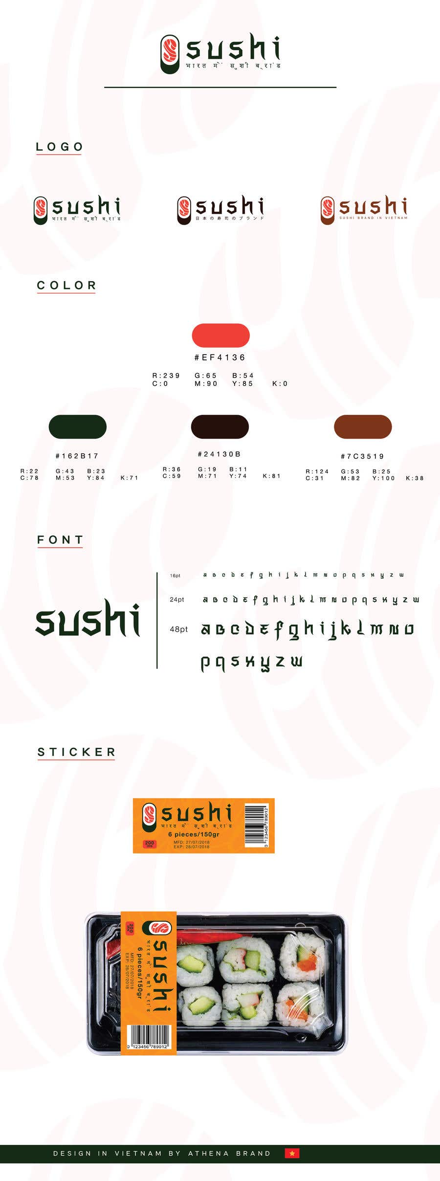
    The smart use of "S" in Sushi visually is good. But the Font used for the word "SUSHI" as well as Hindi at bottom don't look good.
    I would like to point out, as I have done in "Requirements", that we need it to have an international look, although this brand is for India market, Indians like western brands more than Indian brands and also consider them to be superior. So we want the design to reflect Japanese/International look, not fusion with Indian.

    • 5 años atrás
    1. shubhamsingh1988
      Organizador del concurso
      • 5 años atrás

      Also, need a name. "Sushi" as name is too generic.

      • 5 años atrás
    2. cuongdesigner
      cuongdesigner
      • 5 años atrás

      Your brand name is what?
      that must be a "Sushi" or "Sushi Japan"

      • 5 años atrás