contest LF

  • Estado: Closed
  • Premio: €20
  • Propuestas recibidas: 3
  • Ganador: mekuig

Resumen del concurso

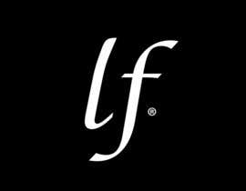
Hello, I want to improve my logo. the logo is attached.
the logo is done with the "monotype corsiva" character.
I would like the letter L is in harmony with the letter F
Thank you to keep the "monotype corsiva" character. Character with the letter L looks like a C.
Thank you redraw the letter L for easier reading and better harmony with the F.
The black background and the circle are not essential.
Thank you for your suggestions.

Habilidades recomendadas

Comentarios del empleador

“@mekuig won the contest on 16 December 2013”

Imagen del perfil seleeguegbelet, France.

Tablero de aclaración pública

  • parmventure
    parmventure
    • 10 años atrás

    Please provide a feedback for #107 - 109

    • 10 años atrás
  • Balghari91
    Balghari91
    • 10 años atrás

    Please feedback entry #102

    • 10 años atrás
  • vladspataroiu
    vladspataroiu
    • 10 años atrás

    Hello, I've added three variations for your logo, #87, #88 and #89, let me know what you think. Thanks.

    • 10 años atrás
  • mekuig
    mekuig
    • 10 años atrás

    Hello! I send you a new alternative for your project whit the modifications. Please feedback for the entries #80, #81 and #82. Thank you very much! Greetings!

    • 10 años atrás
  • pinetown71
    pinetown71
    • 10 años atrás

    you thoughts on #60 and 64
    Thanks

    • 10 años atrás
  • jojohf
    jojohf
    • 10 años atrás

    If you please feedback #32 Thanks

    • 10 años atrás
  • cornaciualex
    cornaciualex
    • 10 años atrás

    Hello ! Please check out project #14 and #15 please and leave me some feeback . I would appreciate. Thank you !

    • 10 años atrás
  • moisanrazvan
    moisanrazvan
    • 10 años atrás

    Hi
    Do you want the background to be black 100% and the letters white or i can change the colours ?

    • 10 años atrás
    1. seleeguegbelet
      Organizador del concurso
      • 10 años atrás

      Hello,
      The black background and the circle , and the letters white are not essential.
      Thank you for your suggestions.

      • 10 años atrás
    2. moisanrazvan
      moisanrazvan
      • 10 años atrás

      ok u helped me , i've done some logos maybe u chose one of mine , have a nice day

      • 10 años atrás
  • seleeguegbelet
    Organizador del concurso
    • 10 años atrás

    I want the L fits better in the logo, an L with the curves of the letter F, thank you to keep the "monotype corsiva" character
    I want a visually harmonious result ... work is done on the letter L

    • 10 años atrás
    1. mekuig
      mekuig
      • 10 años atrás

      Hello! I send a design for your project. Please feedback for the entries #8 and #9. Thank you very much! Greetings!

      • 10 años atrás
    2. seleeguegbelet
      Organizador del concurso
      • 10 años atrás

      I would like the letter L is in harmony with the letter F
      Thank you to keep the \"monotype corsiva\" character. Character with the letter L looks like a C.
      Thank you redraw the letter L for easier reading and better harmony with the F.

      • 10 años atrás
  • STPL2013
    STPL2013
    • 10 años atrás

    Hi CH,
    Greetings.
    Kindly comment on Entry #1.
    Warm regards.

    • 10 años atrás

Mostrar más comentarios

Cómo comenzar con los concursos

  • Publica tu concurso

    Publica tu concurso Fácil y rápido

  • Recibe montones de propuestas

    Consigue toneladas de propuestas De todo el mundo

  • Elige la mejor propuesta

    Elige la mejor propuesta ¡Descarga fácilmente los archivos!

Publica un concurso ahora o únete a nosotros hoy